| N° | Project | Description | Area | Year | |||||||||||||||
|---|---|---|---|---|---|---|---|---|---|---|---|---|---|---|---|---|---|---|---|
| 32 | Marimo | Open-source contributions to a reactive Jupyter notebook alternative | Data science | 2024 | |||||||||||||||
Tufte Pandoc CSS is an attempt to make it as easy as possible to get
started using Tufte
CSSIf you’ve never heard of Tufte CSS before, take a
second to check it out! Tufte CSS provides tools to style web articles using the ideas demonstrated by Edward Tufte’s books and handouts. Tufte’s style is known for its simplicity, extensive use of sidenotes, tight integration of graphics with text, and carefully chosen typography. Tufte CSS was created by Dave Liepmann and is now an Edward Tufte project. The original idea was cribbed from Tufte LaTeX. We give hearty thanks to all the people who have contributed to those projects. Finally, a reminder about the goal of this project. The web is not print. Webpages are not books. Therefore, the goal of Tufte CSS is not to say “websites should look like this interpretation of Tufte’s books” but rather “here are some techniques Tufte developed that we’ve found useful in print; maybe you can find a way to make them useful on the web”. Tufte CSS is merely a sketch of one way to implement this particular set of ideas. It should be a starting point, not a design goal, because any project should present their information as best suits their particular circumstances.
Organize your document with an
Tufte CSS uses
As a bonus, this excerpt regarding the use of headings provides an
example of block quotes. In Tufte CSS they are just lightly styled,
semantically correct HTML using
In his later
booksBeautiful
Evidence, Tufte starts each section with a bit of
vertical space, a non-indented paragraph, and the first few words of the
sentence set in small caps. For this we use a span with the class
Although paper handouts obviously have a pure white background, the web
is better served by the use of slightly off-white and off-black colors.
Tufte CSS uses
In print, Tufte has used the proprietary Monotype
BemboSee Tufte’s comment in the
Tufte
book fonts thread. font. A similar effect is achieved in
digital formats with the now open-source
ETBook, which Tufte
CSS supplies with a Also notice how Tufte CSS includes separate font files for bold (strong) and italic (emphasis), instead of relying on the browser to mechanically transform the text. This is typographic best practice.
Links in Tufte CSS match the body text in color and do not change on
mouseover or when clicked. Here is a dummy example that
goes nowhere. These links are underlined, since this is the most widely
recognized indicator of clickable text.
Blue text, while also a widely recognizable
clickable-text indicator, is crass and distracting. Luckily, it is also
rendered unnecessary by the use of underlining. However, because
most browsers’ default underlining does not clear descenders and is so
thick and distracting, the underline effect is instead achieved using
CSS trickery involving background gradients instead of standard
As always, these design choices are merely one approach that Tufte CSS provides by default. Other approaches can also be made to work. The goal is to make sentences readable without interference from links, as well as to make links immediately identifiable even by casual web users.
If you’d like to introduce your page or a section of your page with some
quotes, use epigraphs. Modeled after chapter epigraphs in Tufte’s books
(particularly Beautiful Evidence), these are
One of the most distinctive features of Tufte’s style is his extensive use of sidenotes.This is a sidenote. Sidenotes are like footnotes, except they don’t force the reader to jump their eye to the bottom of the page, but instead display off to the side in the margin. Perhaps you have noticed their use in this document already. You are very astute. Sidenotes are a great example of the web not being like print. On sufficiently large viewports, Tufte CSS uses the margin for sidenotes, margin notes, and small figures. On smaller viewports, elements that would go in the margin are hidden until the user toggles them into view. The goal is to present related but not necessary information such as asides or citations as close as possible to the text that references them. At the same time, this secondary information should stay out of the way of the eye, not interfering with the progression of ideas in the main text. Sidenotes consist of two elements: a superscript reference number that goes inline with the text, and a sidenote with content. To add the former, just put a label and dummy checkbox into the text where you want the reference to go, like so:
You must manually assign a reference
Immediately adjacent to that sidenote reference in the main text goes
the sidenote content itself, in a
If you want a sidenote without footnote-style numberings, then you want
a margin note.
This is a margin note. Notice there isn’t a number
preceding the note. On large screens, a margin note is just a
sidenote that omits the reference number. This lessens the distracting
effect taking away from the flow of the main text, but can increase the
cognitive load of matching a margin note to its referent text. However,
on small screens, a margin note is like a sidenote except its
viewability-toggle is a symbol rather than a reference number. This
document currently uses the symbol ⊕ (
Margin notes are created just like sidenotes, but with the
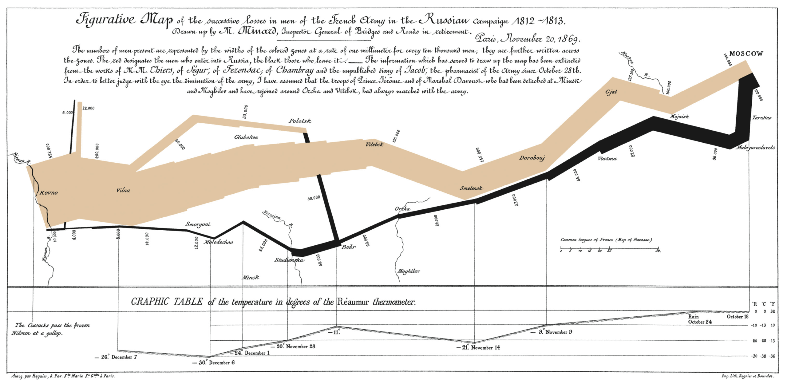
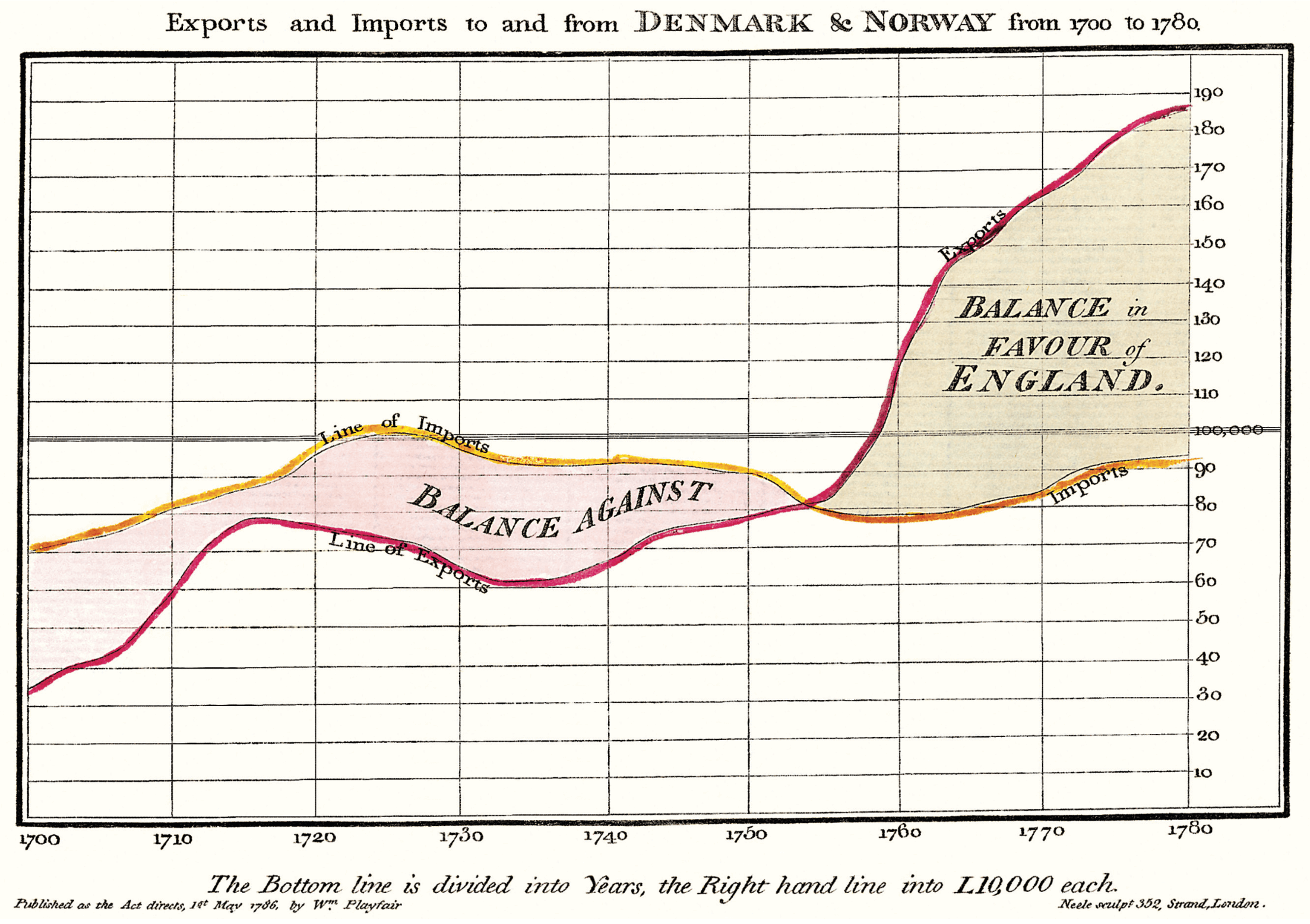
Figures in the margin are created as margin notes, as demonstrated in the next section. Tufte emphasizes tight integration of graphics with text. Data, graphs, and figures are kept with the text that discusses them. In print, this means they are not relegated to a separate page. On the web, that means readability of graphics and their accompanying text without extra clicks, tab-switching, or scrolling.
Figures should try to use the From Edward Tufte, Visual Display of Quantitative Information, page 92.
If you need a full-width figure, give it the 
One obstacle to creating elegant figures on the web is the difficulty of
handling different screen sizes, especially on the fly. Embedded
You can use this class on a
Technical jargon, programming language terms, and code samples are
denoted with the
Extended code examples should live in a
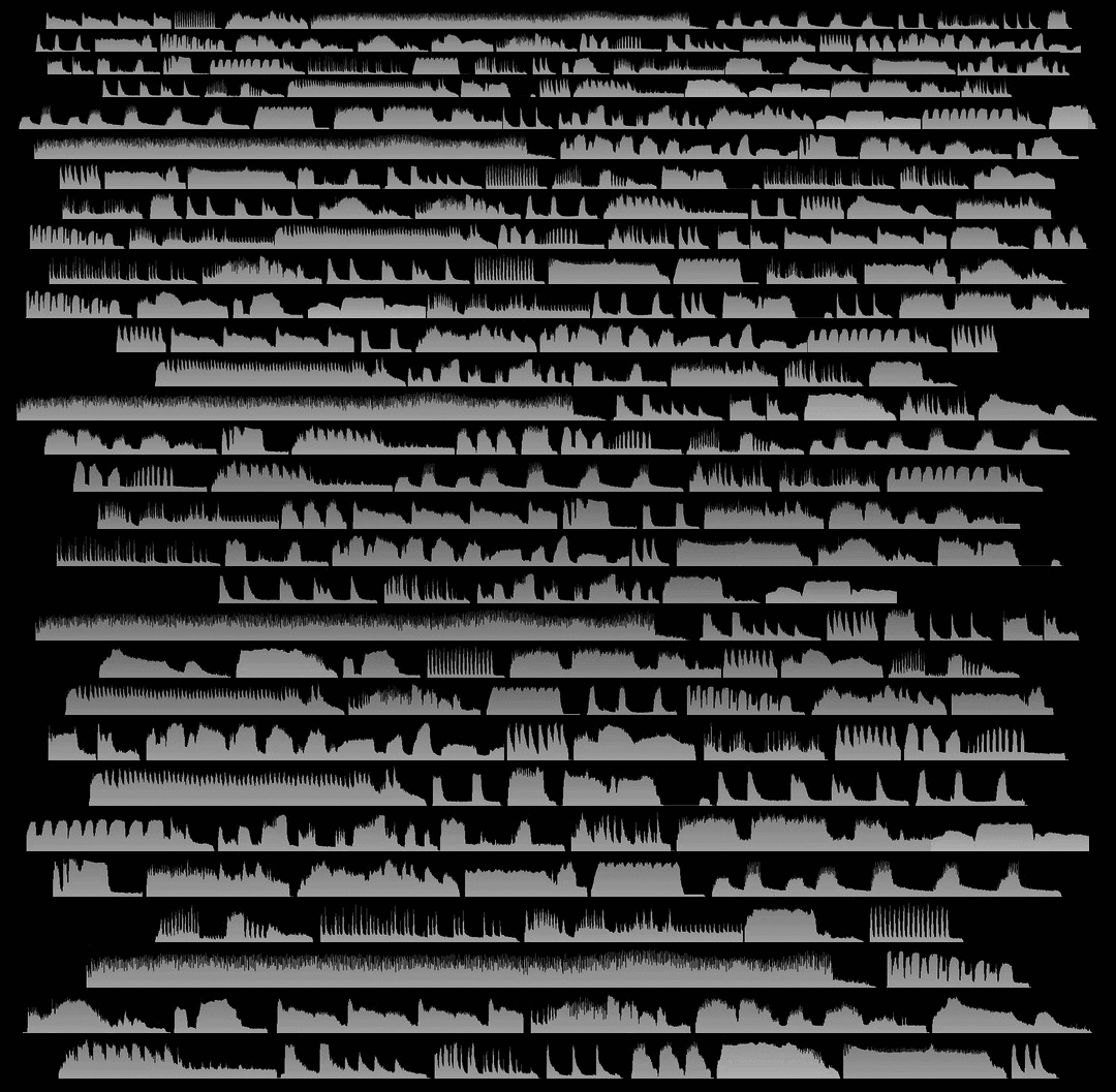
Tufte CSS provides support for Edward Tufte and Adam Schwartz’s
ImageQuilts. See the
ET
forum announcement thread for more on quilts. Some have ragged
edges, others straight. Include these images just as you would any other
This is an ImageQuilt surveying Chinese calligraphy, placed in a full-width figure to accomodate its girth: 
Here is an ImageQuilt of 47 animal sounds over and over, in a figure constrained to the main text region. This quilt has ragged edges, but the image itself is of course still rectangular. 
Many thanks go to Edward Tufte for leading the way with his work. It is only through his kind and careful editing that this project accomplishes what it does. All errors of implementation are of course mine. Sidenotes in Markdown
Tufte Pandoc CSS aims to be a set of starter files for your next project. What that means is that it provides a number of CSS files, a Pandoc template, a Makefile, and more to make it as easy as possible to write Markdown using Tufte CSS. The biggest barrier that this project overcomes is that Pandoc
Markdown doesn’t support side notes nor margin notes by default. This
project adds that functionality.In particular, a separate library called By default, if you use the normal Pandoc syntax for creating
footnotes, they’ll become Tufte CSS-style side notes. To get margin
notes (i.e., side notes without numbers), just include Syntax-Highlighted CodeblocksPandoc Markdown is excellent for styling code blocks. Indeed, you’ve already seen their effect in this document. You can use any of the methods for creating syntax highlighted code blocks Pandoc permits. For example: In this document, you’re also seeing the effect of the Solarized color scheme. You can use any of the color schemes Pandoc ships with by default, or this one. Another feature Pandoc allows that Tufte Pandoc CSS supports is generating line numbers to accompany a code sample: Figures & SectionsUnfortunately, HTML figures and sections don’t have special Markdown syntax. To include them in your document, you’ll have to use the raw HTML. On the bright side, this usually ends up being pretty painless. In particular for sections, if you’re satisfied with the top-most
headings being wrapped in Tufte Pandoc CSS improves support for full-width tables and code blocks. Special attention has been given to ensure that they’re fully responsive at all viewports, just like normal full-width figures. Here’s a sample full-width table:
As one last quick note: the original Tufte CSS recommends that you
always wrap images in Installation & UsageAs mentioned above, Tufte Pandoc CSS is designed to be a collection of starter files to help you with your next Markdown project. You can learn what files and tools are available on the GitHub repository. As for usage, you are strongly encouraged to look at the source of this document. There’s also an HTML-to-Markdown port of the original Tufte CSS page along with the accompanying source. One goal of this project is to support as many of the features you’d “expect” to work that are available in Pandoc. If your favorite feature doesn’t work, let us know with an issue. |
|||||||||||||||||||
| 31 | Lex | Linguistic tool for exhaustive and context-driven vocabulary acquisition | Natural language processing | 2023-2024 | |||||||||||||||
| Not filed yet. | |||||||||||||||||||
| 30 | Neural machine translation | Implementation and training of a lexical attention model and the Transformer self-attention mechanism to translate German to English | Natural language processing | 2024 | |||||||||||||||
| Not filed yet. | |||||||||||||||||||
| 29 | Predicting number agreement with RNNs and GRUs | Implementation and training of a recurrent neural network,The BPTT algorithm, and a gated recurrent unit to predict number agreement in the English language | natural language processing | 2024 | |||||||||||||||
| Not filed yet. | |||||||||||||||||||
| 28 | Deep reinforcement learning exploration | Implementation of various deep RL algorithms using OpenAI’s gym learning environment including Deep Q-Networks and DDPG for continuous RL | Reinforcement learning | 2024 | |||||||||||||||
| Not filed yet. | |||||||||||||||||||
| 27 | Linux kernel experimentation | Kernel module implementations for the original Linux kernel to collect memory statistics and to employ a customised paging algorithm | Systems programming | 2024 | |||||||||||||||
| Not filed yet. | |||||||||||||||||||
| 26 | Eric Janto website redesign #3 | Redesign and reimplementation of a personal website | Web development | 2024 | |||||||||||||||
| Not filed yet. | |||||||||||||||||||
| 25 | Bookmarks landing page | Lightweight browser landing page for displaying bookmarks | Web development | 2024 | |||||||||||||||
| Not filed yet. | |||||||||||||||||||
| 24 | Interactive lecture videos | Implementation of interactive lecture videos to integrate spaced-repetition practice via flashcards | Web development | 2023 | |||||||||||||||
| Not filed yet. | |||||||||||||||||||
| 23 | Part-of-speech tagger | Implementation and training of a Hidden-Markov-Model with a Viterbi training algorithm for part-of-speech tagging for the English language | Natural language processing | 2023 | |||||||||||||||
| Not filed yet. | |||||||||||||||||||
| 22 | Language identification and classification | Training of the character-level Lgram model to distinguish English from non-english text | Natural language processing | 2023 | |||||||||||||||
| Not filed yet. | |||||||||||||||||||
| 21 | Generative music | MaxMSP project to generate music from natural language instructions | Creative coding | 2023 | |||||||||||||||
| Not filed yet. | |||||||||||||||||||
| 20 | Blackford | An improved search engine for the AOC3 platform | Data engineering | 2023 | |||||||||||||||
| Not filed yet. | |||||||||||||||||||
| 19 | Human Cadherin-7 analysis | Sequence retrieval and analysis of Human Cadherin-7 analysis | Bioinformatics | 2023 | |||||||||||||||
| Not filed yet. | |||||||||||||||||||
| 18 | Gene-disease mapping data exploration | Exploration of the the GenCC database of gene-disease mappings to compare the genetic basis of neural and digestive system disorders | Bioinformatics | 2023 | |||||||||||||||
| Not filed yet. | |||||||||||||||||||
| 17 | Mac setup | Script for the automated setup of MacOS-based machines | Scripting | 2023 | |||||||||||||||
| Not filed yet. | |||||||||||||||||||
| 16 | Name variations | Implementation and visualisation of a name variation algorithm | Natural language processing | 2022 | |||||||||||||||
| Not filed yet. | |||||||||||||||||||
| 15 | Cargo vessel routing optimiser | Solution for reducing carbon emissions of vessels by optimising cargo-loading and routing logistics based on AIS (Automatic Identification System) data | Data science | 2022 | |||||||||||||||
| Not filed yet. | |||||||||||||||||||
| 14 | Bionic Markdown | NPM module for producing Markdown conforming to Bionic Reading standards | Web development | 2022 | |||||||||||||||
| Not filed yet. | |||||||||||||||||||
| 13 | Wikipedia cmd+k menu | A tool for summarising and explaining Wikipedia articles by communicating with an OpenAI LLM | Web development | 2022 | |||||||||||||||
| Not filed yet. | |||||||||||||||||||
| 12 | Web watch | Tool to get notified about changes made to third-party websites | Scripting | 2022 | |||||||||||||||
| Not filed yet. | |||||||||||||||||||
| 11 | Frontmatter processor | NPM module to manipulate metadata fields in Markdown files | Web development | 2022 | |||||||||||||||
| Not filed yet. | |||||||||||||||||||
| 10 | Eric Janto website redesign #2 | Redesign and reimplementation of a personal website | Web development | 2022 | |||||||||||||||
| Not filed yet. | |||||||||||||||||||
| 9 | Note publishing website | A front-end for publishing academic Markdown notes | Web development | 2021 | |||||||||||||||
| Not filed yet. | |||||||||||||||||||
| 8 | Sliding window protocol | Implementation and analysis of the Sliding Window Protocol | Networks | 2021 | |||||||||||||||
| Not filed yet. | |||||||||||||||||||
| 7 | Booking automation | Selenium-based tool to automatically book swim session slots | Scripting | 2021 | |||||||||||||||
| Not filed yet. | |||||||||||||||||||
| 6 | MIPS simulator | A 5-stage multi-cycle processor simulator for the MIPS assembly language | Systems programming | 2021 | |||||||||||||||
| Not filed yet. | |||||||||||||||||||
| 5 | EUJO website | Website design and implementation for the Edinburgh University Jazz Orchestra | Web development | 2021 | |||||||||||||||
| Not filed yet. | |||||||||||||||||||
| 4 | Eric Janto website redesign #1 | Redesign and reimplementation of a personal website | Web development | 2021 | |||||||||||||||
| Not filed yet. | |||||||||||||||||||
| 3 | Corona-Warn-App | Smoke testing of UI prototypes for the Germany’s official COVID-19 exposure notification app | Software testing | 2020 | |||||||||||||||
| Not filed yet. | |||||||||||||||||||
| 2 | EUSO website | Website design and implementation for the Edinburgh University String Orchestra | Web development | 2020 | |||||||||||||||
| Not filed yet. | |||||||||||||||||||
| 1 | Eric Janto website | Initial implementation of a personal website | Web development | 2020 | |||||||||||||||
| Not filed yet. | |||||||||||||||||||

 F.J.
Cole, “The History of Albrecht Dürer’s Rhinoceros in Zooological
Literature,” Science, Medicine, and History: Essays on the Evolution
of Scientific Thought and Medical Practice (London, 1953), ed. E.
Ashworth Underwood, 337-356. From page 71 of Edward Tufte’s Visual
Explanations.